April Developer Update
Flight Planning
Hi there!
Another month have passed and it’s time to give you an idea about current work progress and state of the game in general. So, let’s get started. Note, that all screenshots listed in this post are presenting work in progress.
I can split this month of work into three main categories. The first one would be an assembling different game systems into the working game. I talked about these systems in the previous dev updates, they are: spaceport building, orbital mechanics, planet generation and everybody’s favorite rockets and flight systems. Before, they existed separated from each other and you had basically four different mini-games without gameplay.
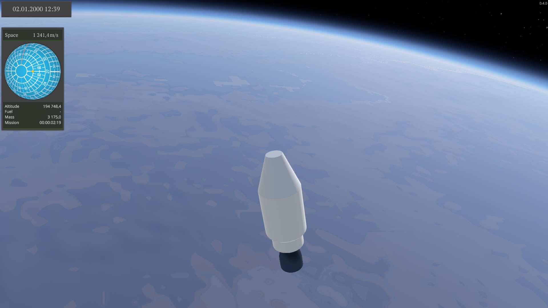
 It was an incredible feeling to reach low Earth orbit in Rocket Science for the first time
Now the spaceport is located in the right spot on the Earth and have a correct day-night cycle, Sun azimuth and altitude and also proper night skies with stars. This spot is taken from the longitude and latitude configured via file. Moreso it correctly calculates the altitude of this position on the planet and places the spaceport right on top of the planet’s surface. While this spot will be pre configured on the release (with the longitude and latitude of Vostochny Cosmodrome), it opens up opportunities for future features, like selecting the place of the spaceport on the start of the game or for user mods (It was interesting to place the spaceport on the Mount Everest even for me).
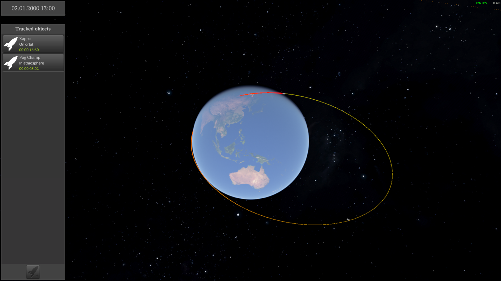
From the spaceport building named Control Center you can open the map of Solar System and look at all launched spacecrafts at this moment. You can select any spacecraft and load it in the flight mode. You can also launch the new rocket from here by selecting rocket draft and flight plan. And finally, you can design your own rocket in the Assembly Shop from the parts that you have.
 A view of the solar system from the Control Center
There is nothing new here compared to other games, but the basic game loop was established and I can start to finally evolve other systems, like spaceport building and flight planning from there.
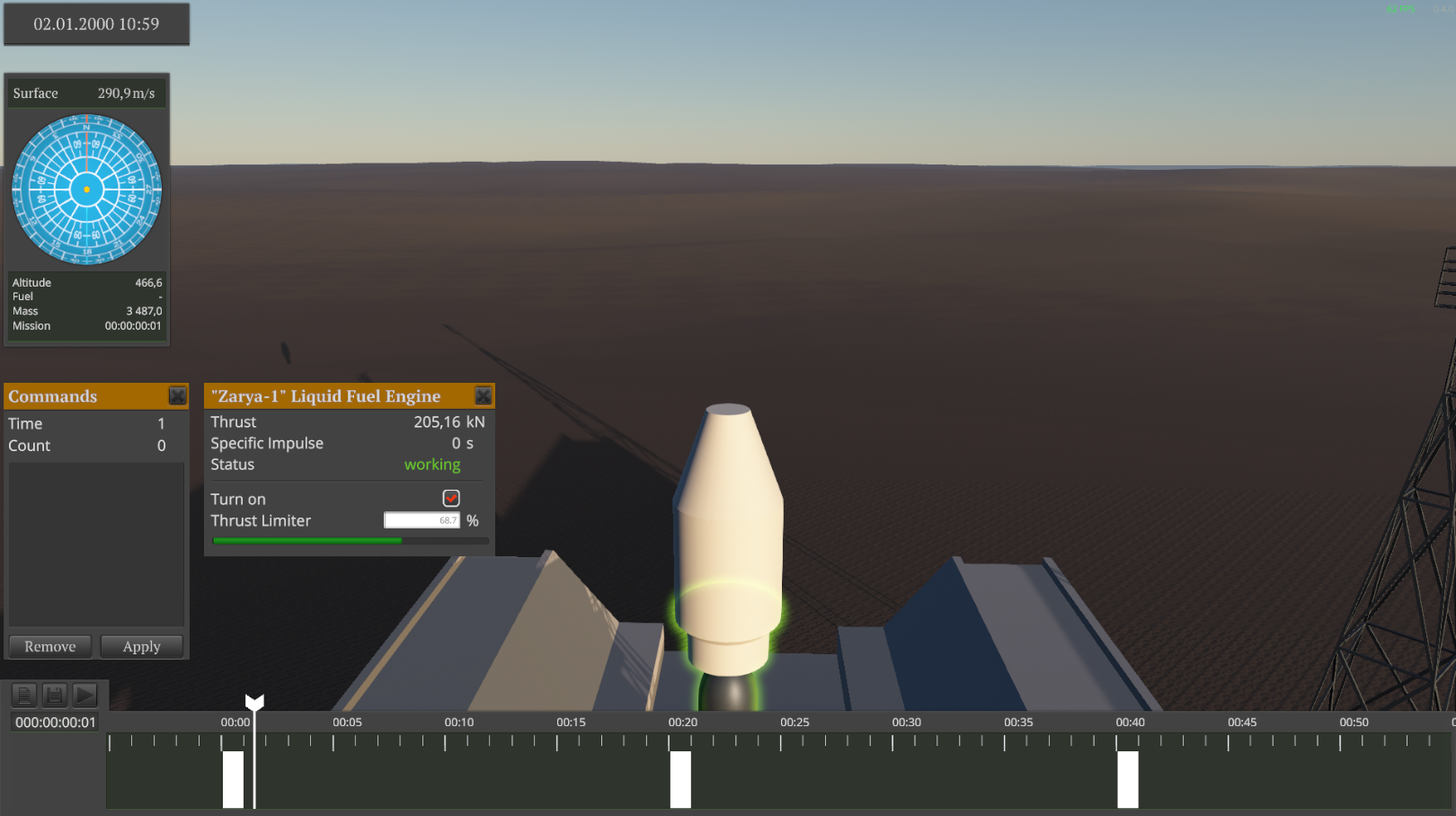
Speaking of which, I finished the work on the flight planning interface and it will fall into second category. So, what I would say about it? It was the hardest part of the game to develop at this moment. I spent almost half of month on this task (significantly more, than I planned). There were so many nuances and edge cases that I could not imagine. But it was completed (with some bugs of course).
This works as follows: you pause the time, select the rocket part, and its interface opens. You make changes and flight command is added to the timeline. Then you can resume the time and see how the command affects the state of the rocket. You can move forward and backward in time, add new commands and move or remove the existing ones how you would like. And flight planning system will recalculate the whole word state for you!
As I expected, this system turned out to be great for complex flight planning, where high accuracy is required, like docking with the space station. And it is also great for flights automatisation. But as I thought, it feels over complicated for simple things, for example, if you want just launch the rocket and fly around for fun. So I will rethink this part of the game and with the high chance will return the direct control over the rocket back to the player. Of course, you will not be able to turn the time back or even pause it outside of flight planning interface. Also all commands will be immediately applied to the rocket. So you will basically get the ability to control the rocket like in other games. I feel like more different ways to perform a flight are definitely better for the game. On the other hand, it will increase the required development time, but more on that later.
And the last but not least is the UI design. I feel like a lot of indie developers hate to work on UI for games, often postpone this task as long as possible and just slap some default grey panels and white buttons into the game and then push the release button. I am also not very enthusiastic about working on the UI (it contains a lot of repetitive tasks, that you did millions of times in the past), but more than that I hate such “made to fuck off” UI. So I spent the remaining part of the month to lay the groundwork for the best interface I could make. Nothing fantastic here, but it looks acceptable for me.
For those of you who read this dev update so far I prepared and published the Development Roadmap and you can find it here. You can get the basic idea about planned features and current work progress from it. As always, everything is subject to change, but as a time goes, it will happen less often.
The last thing I want to talk about is the release date. Initially it was scheduled for May 31. But I thought a lot about it and came to the conclusion that I don’t want to release some smashed together and barely working systems and hope that it goes away. Even in the Early Access I want to give you some complete game experience and minimum three hours of gameplay. And one month left is not enough to reach this goal. So I decided to postpone the release date to July. The exact date will be announced later. But I hope I will manage to prepare the game trailer and update screenshots for the store page by the end of the May.
Thank you for your attention, don’t forget to join to our community on Discord or follow me on Twitter or subscribe to my Youtube channel. See you next time.
